Visualizing Data using ggplot2 and ggflags
In this post I explore ways of using ggplot2 and ggflags to plot album sales and chart data from the Taylor Swift and Beyoncé Tidy Tuesday dataset (as shown here). I then create charts comparing sales in the UK and US specifically.
References and setup
Useful posts introducing the ggflags package drawn on in the examples posted here (alongside other options for using maps and flags in R) include:
-
All around the world: Maps and flags in R by quantixed
-
Examining speeches from the UN Security Council Part I and Add circular flags to maps and graphs with ggflags package in R from R for Political Science
-
An advanced example of using a modified version of ggflags and gganimate for animating top 20 national football teams by goals scored by basarabam
First, let’s load packages and read in the data:
#load packages
library(tidyverse)
library(ggflags)
library(countrycode) # to convert country names to country codes
library(tidytext) # for reorder_within
library(scales) # for application of common formats to scale labels (e.g., comma, percent, dollar)

#load data
sales <- readr::read_csv('https://raw.githubusercontent.com/rfordatascience/tidytuesday/master/data/2020/2020-09-29/sales.csv')
ggflags is the first R package I’ve used that is not available on CRAN. This meant I needed to install the devtools package first, and then install the ggflags package from github using devtools::install_github('rensa/ggflags').
Fix country codes
First, let’s see what country codes are included in the sales data:
sales %>%
  distinct(country)
## # A tibble: 10 x 1
##    country
##    <chr>
##  1 US
##  2 WW
##  3 AUS
##  4 UK
##  5 JPN
##  6 CAN
##  7 FRA
##  8 <NA>
##  9 World
## 10 FR
Reviewing the ggflags documentation shows the iso2c country codes associated with each flag. Let’s use mutate() and ifelse() to change non-standard codes:
sales <- sales %>%
  mutate(country = ifelse(country == "AUS", "AU", country)) %>%
  mutate(country = ifelse(country == "CAN", "CA", country)) %>%
  mutate(country = ifelse(country == "FRA", "FR", country)) %>%
  mutate(country = ifelse(country == "JPN", "JP", country)) %>%
  mutate(country = ifelse(country == "UK", "GB", country)) %>%
  mutate(country = ifelse(country == "World", "WW", country))
And check that we have recoded successfully:
sales %>%
  distinct(country)
## # A tibble: 8 x 1
##   country
##   <chr>
## 1 US
## 2 WW
## 3 AU
## 4 GB
## 5 JP
## 6 CA
## 7 FR
## 8 <NA>
Alternatively, if the data were in a standardized format, we could use the countrycode() function from the countrycode package to map country names or country codes from one format to another. The example shown below (not run), for example, would create a new variable (code) in the sales data frame which would translate the country column from “country.name” to “iso2c” format:
sales$code <- countrycode(sales$country, "country.name", "iso2c")
If you are given a database of country codes and aren’t sure what format they are in, using guess_field() shows what percentage of values match which coding system:
countrycode::guess_field(sales$country, min_similarity= 80)
##                                code percent_of_unique_matched
## ecb                             ecb                      87.5
## genc2c                       genc2c                      87.5
## iso2c                         iso2c                      87.5
## wb_api2c                   wb_api2c                      87.5
## cldr.name.bem         cldr.name.bem                      87.5
## cldr.name.cu           cldr.name.cu                      87.5
## cldr.name.dua         cldr.name.dua                      87.5
## cldr.name.kkj         cldr.name.kkj                      87.5
## cldr.name.kl           cldr.name.kl                      87.5
## cldr.name.mgo         cldr.name.mgo                      87.5
## cldr.name.nnh         cldr.name.nnh                      87.5
## cldr.name.pa_arab cldr.name.pa_arab                      87.5
## cldr.name.rw           cldr.name.rw                      87.5
## cldr.name.uz_arab cldr.name.uz_arab                      87.5
## cldr.name.xh           cldr.name.xh                      87.5
## cldr.short.gv         cldr.short.gv                      87.5
## cldr.variant.rw     cldr.variant.rw                      87.5
## cldr.variant.xh     cldr.variant.xh                      87.5
This tells us that after recoding, 87.5% of our rows are coded with a valid iso2c country code (note that both WW and NA are invalid codes we will need to deal with appropriately when graphing data).
Number of copies sold by country for a specified album
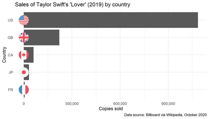
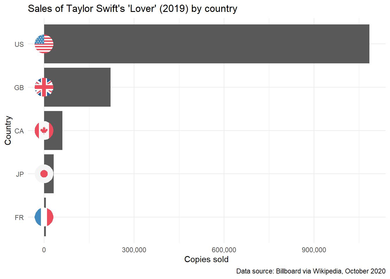
Let’s start with a simple example and graph album sales by country specifically for Taylor Swift’s 2019 album, Lover, using the geom_flag() function to plot circular flags on each bar in our graph representing a country.
First, we filter the data to include only rows where the country field is not equal to WW. Note that by default this also excludes rows where country is coded as NA. If we don’t exclude these rows and apply the geomflag() function to an object containing invalid codes, we receive an error message: “unable to find an inherited method for function ‘grobify’ for signature “NULL”.
The geom_flag() function needs iso2c country codes in lower case format, so the next part of this code converts country codes to lower case (as code). The next line of code sets country as a factor and reorders countries manually by descending order of copies sold.
We then take the sales and country data, and plot a column graph.
We use the geom_flag() function to plot the flags at the location specified on the x axis, using the code variable to assign flags, and the size argument to vary the size of the flags. The default location for the flags appears to be at the end of each bar, we can change this by including, for example, the x = 0 argument if we want our flags at the start of the bars.
We then give our axes appropriate labels, set an appropriate scale for our x axis (here we use labels = comma to add commas into the x axis labels), and specify our desired theme.
Here is the full code used to generate the graph:
# chart with flags

sales %>%
  filter((title %in% c("Lover") & country != "WW")) %>%
  mutate(code = tolower(country)) %>%
  mutate(country = fct_reorder(country, sales)) %>%
  ggplot(aes(sales, country)) +
  geom_col() +
  geom_flag(x = 0, aes(country = code), size = 10) +
  labs(y = "Country", x = "Copies sold", title = "Sales of Taylor Swift's 'Lover' (2019) by country",
       caption = "Data source: Billboard via Wikipedia, October 2020") +
  scale_x_continuous(labels = comma) +
  theme_minimal()
Total album sales by country and artist
Now, let’s graph total album sales by country for Beyoncé and Taylor Swift, again using the geom_flag function to plot circular flags on each bar in our graph. Note that our data is not complete, so this is more for the purposes of exploring ggplot2 and ggflags functionality than for making meaningful comparisons between these artists.
Once again, we filter to include only rows where the country field is not equal to WW and convert country codes to lower case.
The next line of code sets country as a factor and reorders countries manually (by descending order of copies sold). See Claus O. Wilke’s Getting things into the right order, for additional information on ways to reorder the bars in bar plots. For example, use fct_infreq() to reorder based on frequency, and fct_rev() to reverse specified order (often useful since ggplot2 orders from the bottom of the graph to the top).
Let’s now mutate the sales data by to calculate copies sold in millions, and take the millions and country data, to plot a column graph. We plot flags using geom_flag() as above, and give our axes appropriate labels.
Using facet_wrap(~artist) allows us to create separate graphs for each artist.
Here is the full code used to generate the graph:
sales %>%
  filter((country != "WW")) %>%
  mutate(code = tolower(country)) %>%
  mutate(country = fct_relevel(country, "FR", "AU", "JP", "CA", "GB", "US")) %>%
  mutate(millions = sales/1000000) %>%
  ggplot(aes(millions, country)) +
  geom_col() +
  geom_flag(x = 0, aes(country = code), size = 7) +
  labs(y = "Country", x = "Copies sold (Millions)",
       title = "Total album sales by country for Beyoncé and Taylor Swift",
       caption = "Data source: Billboard via Wikipedia, October 2020") +
  facet_wrap(~artist) +
  theme_minimal()
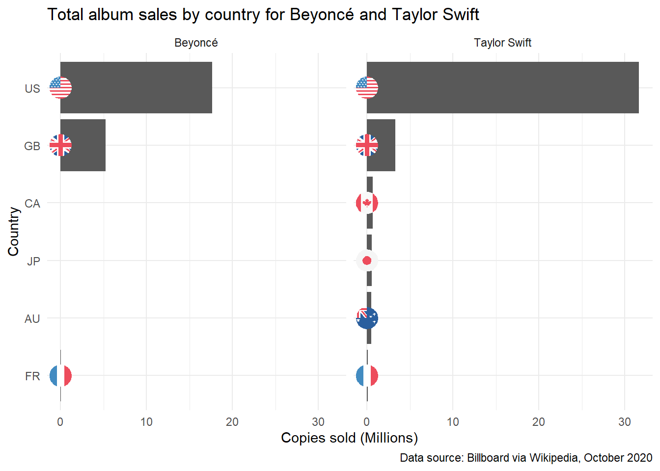
This chart confirms what we already know about this data, that we have more country-specific sales data for Taylor Swift than Beyoncé (and the worldwide sales figures in our extract are greater than the sum of the country-specific data provided). We need to specify only relevant countries to compare if we’re looking comparatively at sales by the two artists. But first, for more ggplot2 and ggflags practice, let’s try one more graph using facet_wrap().
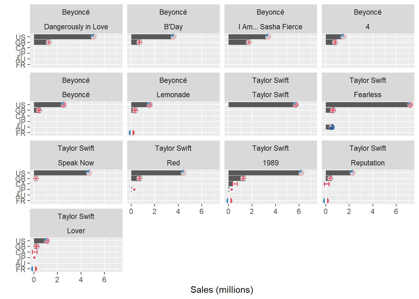
Plotting sales data for multiple albums
We can also plot sales data for each album, using facet_wrap() to create separate graphs for each album, grouped by artist.
The code below once again uses filter() to include only rows where the country field is not equal to WW and mutate() to convert country codes to lower case and calculate sales in millions of copies sold. I then use code copied from Georgios Karamanis to remove extraneous characters from the released field and convert to a date. We can then use fct_reorder() to order the albums by release date, and fct_relevel() as above to order countries as desired:
# chart with flags

sales %>%
  filter(country != "WW") %>%
  mutate(millions = sales/1000000) %>%
  mutate(released = as.Date(str_remove_all(released, "\\[.+\\]|\\s+\\(.+\\)"), format = "%B %d, %Y")) %>%
  mutate(title = fct_reorder(title, released)) %>%
  mutate(country = fct_relevel(country, "FR", "AU", "JP", "CA", "GB", "US")) %>%
  mutate(code = tolower(country)) %>%
  ggplot(aes(millions, country)) +
  geom_col() +
  geom_flag(aes(country = code), size = 3) +
  facet_wrap(artist ~title) +
  labs(y = "", x = "Sales (millions)")
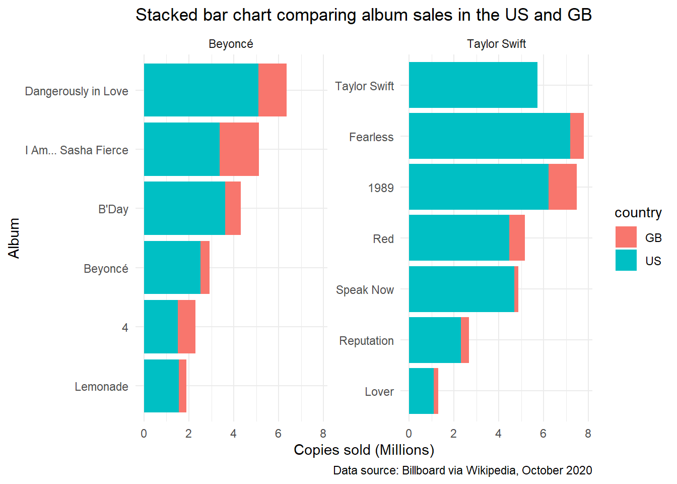
Stacked bar chart comparing sales data for the US and Great Britain
Because our data is incomplete, we need to be careful in the comparisons we make. As shown above, we have sales data for the US and UK for all albums except for Taylor Swift’s self-titled album, so let’s compare the number of copies of each album sold by Beyoncé and Taylor Swift across these two countries.
Here we split the data into facets using the artist variable, and use reorder_within() and scale_x_reordered() to sort titles within each group in descending order of sales. I am grateful to Julia Silge’s Reordering and facetting for ggplot2 for a worked example of these functions. Note that Taylor Swift’s self-titled album lacks UK sales data, and has been presented first by default, breaking this pattern. The use of the scales = free_y argument in the facet_wrap() function is necessary so that albums aren’t repeated for both artists, but are grouped separately by artist.
Here is the full code:
# chart without flags

sales %>%
  filter(country %in% c("US", "GB")) %>%
  mutate(artist = as.factor(artist),
         title = reorder_within(title, sales, artist)) %>%
  mutate(millions = sales/1000000) %>%
  ggplot(aes(x = title, y = millions, fill = country)) +
  geom_col() +
  coord_flip() +
  scale_x_reordered() +
  facet_wrap(~artist, scales = "free_y") +
  labs(y = "Copies sold (Millions)", x = "Album",
       title = "Stacked bar chart comparing album sales in the US and GB",
       caption = "Data source: Billboard via Wikipedia, October 2020") +
  theme_minimal()
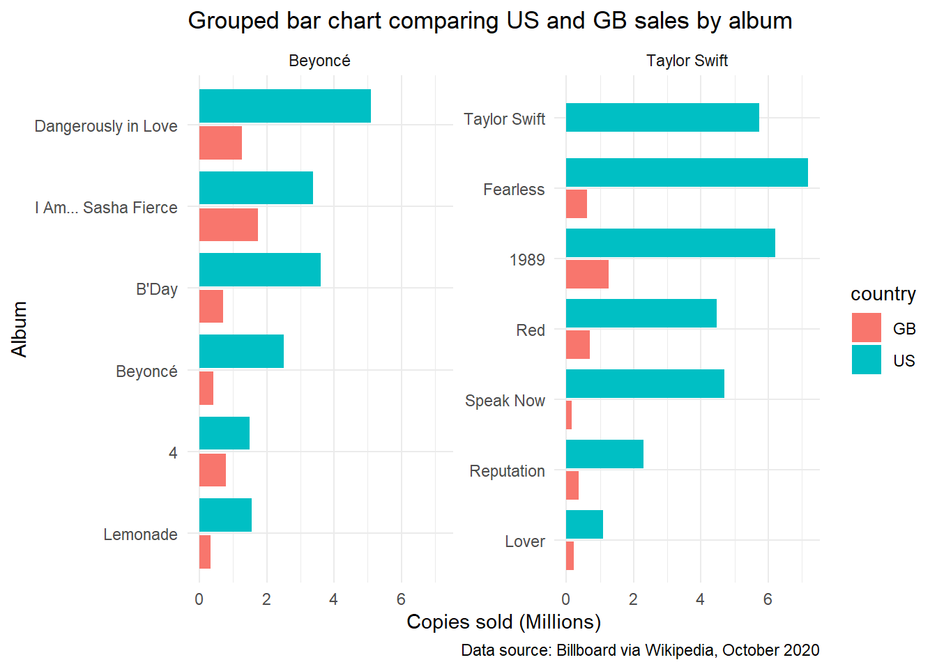
Grouped bar chart comparing sales data for the US and Great Britain
This data could similarly be charted using a grouped bar chart, depending on which features of the data we want to emphasize. The stacked bar chart above makes it easier to compare proportions and totals, while the grouped bar chart makes it easier to compare values across individual bars. (See, for example, Lisa Charlotte Rost’s What to consider when creating stacked column charts).
To generate a grouped bar chart, we need to use the position = position_dodge2 argument in the geom_col() function, and preserve = "single" to ensure that groups with only one row (e.g., Taylor Swift’s self-titled album) don’t take up double the space in the graph:
sales %>%
  filter(country %in% c("US", "GB")) %>%
  mutate(code = tolower(country)) %>%
  mutate(artist = as.factor(artist),
         title = reorder_within(title, sales, artist)) %>%
  mutate(millions = sales/1000000) %>%
  ggplot(aes(millions, title, fill = country)) +
  geom_col(position = position_dodge2(preserve = "single")) +
  scale_y_reordered() +
  facet_wrap(~ artist, scales = "free_y") +
  labs(x = "Copies sold (Millions)", y = "Album",
       title = "Grouped bar chart comparing US and GB sales by album",
       caption = "Data source: Billboard via Wikipedia, October 2020") +
  theme_minimal()
References, resources, and next steps
Other resources that I’ve found useful for visualizing data can be found on my resources page.
In future posts, I’d like to start working with some of the Programme for International Student Assessment (PISA) data, with one goal being to revist these posts and graph data by country, using ggflags to represent each country with its respective flags.
Lynley Aldridge
My research interests include social and educational inequality, transitions from education to employment, education, cross-cultural comparative research, and Rstats.