Summary tables using gt
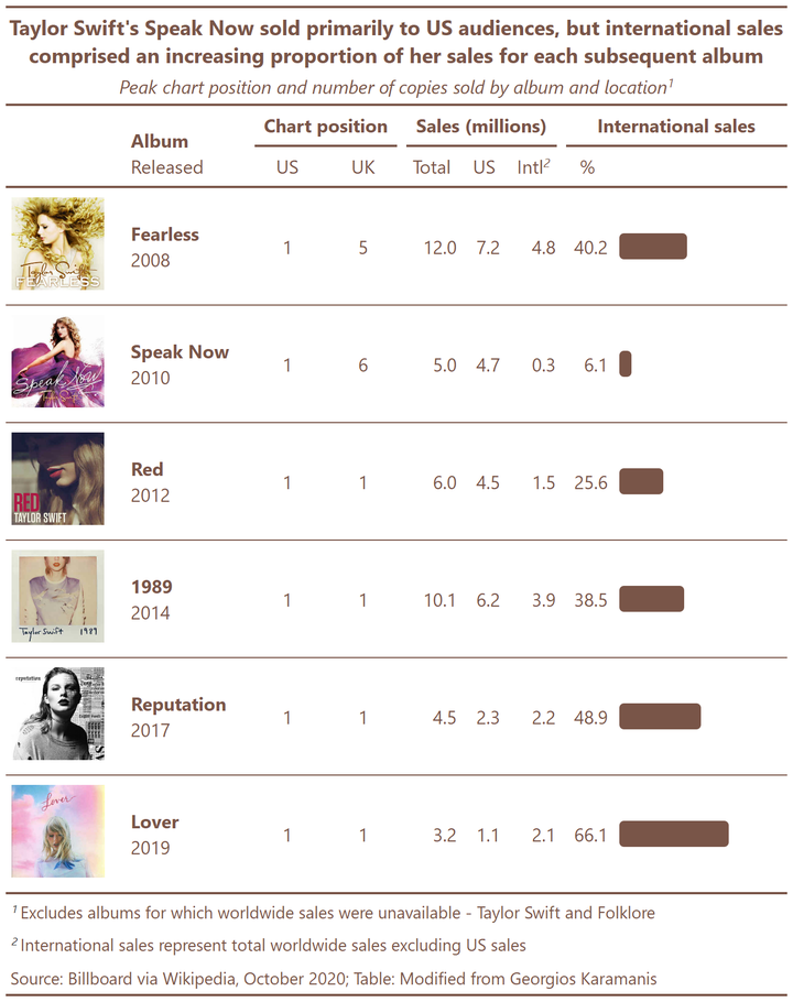
In this post, I walk through the various steps involved in creating the summary table shown here (based on the Tidy Tuesday Taylor Swift data), showcasing various capabilities of the gt package.
Setup
First, let’s load packages and read in the data (as manipulated in a previous post):
#load packages
library(tidyverse)
library(gt) # for summary tables

#load data
albums <- read.csv('https://raw.githubusercontent.com/lynleyaldridge/tidytuesday/main/2020/2020-week40/data/albums.csv')
Tables in R Markdown and blogdown
There are a variety of packages available for producing tables in R, and it’s my impression that choosing the correct option depends partly on the functionality you desire and partly on the output formats you’ll be using. I’ve included some guides to different packages available for generating tables with R on my resources page. In making the below tables in gt, I drew on the package documentation for gt, a worked Dancing With the Stars example from JLaw, and resources from Thomas Mock and Georgios Karamanis referred to below.
A simple table with an inline bar chart
Let’s start by creating a simple table in gt, using gt’s capacity to process custom html functions.
First, we need to define the function we’re wanting to use to create our inline bar chart. I adapted this from Thomas Mock’s Embedding custom HTML in gt tables, which has great examples of many more things custom HTML enables you to do in gt tables:
bar_chart <- function(value, color = "#795548"){
glue::glue("<span style=\"display: inline-block; direction: ltr; border-radius: 4px; padding-right: 2px; background-color: {color}; color: {color}; width: {value}%\"> </span>") %>%
as.character() %>%
gt::html()
}
Next, let’s refresh our memory of the data we have available:
head(albums)
##   X       artist        title year US_chart UK_chart US_sales WW_sales
## 1 1 Taylor Swift Taylor Swift 2006        5       81      5.7       NA
## 2 2 Taylor Swift     Fearless 2008        1        5      7.2     12.0
## 3 3 Taylor Swift    Speak Now 2010        1        6      4.7      5.0
## 4 4 Taylor Swift          Red 2012        1        1      4.5      6.0
## 5 5 Taylor Swift         1989 2014        1        1      6.2     10.1
## 6 6 Taylor Swift   Reputation 2017        1        1      2.3      4.5
##   other_sales US_percent other_percent
## 1          NA         NA            NA
## 2         4.8       59.8          40.2
## 3         0.3       93.9           6.1
## 4         1.5       74.4          25.6
## 5         3.9       61.5          38.5
## 6         2.2       51.1          48.9
To create a table with an inline bar chart using gt, let’s first use the code below to create a new data frame (albums with plots) to use as the basis of this table. This filters albums to include only Taylor Swift albums, dropping albums for which full sales data are unavailable (Taylor Swift and Folklore). We then use mutate() to create a new column (percent_plot) which contains the results of applying the bar_chart function to the values in the other_percent column. Finally, we select columns we want to use in our table:
albums_with_plots <- albums %>%
    filter(artist == "Taylor Swift") %>%
    drop_na() %>%
    mutate(percent_plot = map(other_percent, ~bar_chart(value = .x))) %>%
    select(title, year, US_chart, UK_chart, WW_sales, US_sales, other_sales, other_percent, percent_plot)
Let’s explore what we’ve done by viewing relevant parts of our new data frame (here I select the first two rows and the first, second, eighth and ninth columns):
view(albums_with_plots)[1:2, c(1, 2, 8, 9)]
## title year other_percent
## 1 Fearless 2008 40.2
## 2 Speak Now 2010 6.1
## percent_plot
## 1 <span style="display: inline-block; direction: ltr; border-radius: 4px; padding-right: 2px; background-color: #795548; color: #795548; width: 40.2%"> </span>
## 2 <span style="display: inline-block; direction: ltr; border-radius: 4px; padding-right: 2px; background-color: #795548; color: #795548; width: 6.1%"> </span>
We can see that the html code needed to draw a bar of appropriate width (40.2 for the first row, and 6.1 for the second) has been mapped to the percent_plot column.
Creating a basic table using gt is as simple as applying the gt() function to the data frame:
gt(albums_with_plots)
| title | year | US_chart | UK_chart | WW_sales | US_sales | other_sales | other_percent | percent_plot |
|---|---|---|---|---|---|---|---|---|
| Fearless | 2008 | 1 | 5 | 12.0 | 7.2 | 4.8 | 40.2 | |
| Speak Now | 2010 | 1 | 6 | 5.0 | 4.7 | 0.3 | 6.1 | |
| Red | 2012 | 1 | 1 | 6.0 | 4.5 | 1.5 | 25.6 | |
| 1989 | 2014 | 1 | 1 | 10.1 | 6.2 | 3.9 | 38.5 | |
| Reputation | 2017 | 1 | 1 | 4.5 | 2.3 | 2.2 | 48.9 | |
| Lover | 2019 | 1 | 1 | 3.2 | 1.1 | 2.1 | 66.1 |
Adding images and combining columns
Before looking at the functionality available within gt to format this table, let’s look at some further manipulations we can make to our underlying data frame.
One of the tables that sparked my interest in experimenting with gt was the table Georgios Karamanis made summarizing this data. I adapted his code below to use album images and combine columns.
This code uses the mutate() and paste0() functions to paste data in the title and year columns into the new title_released column (to make a string consisting of the asterisks to signify bold in markdown formatting around the album title, a line break, and then the year the album was released). The stem required for image urls is pasted into the ìmg column before the album name, with .jpg following, to create the path to each image:
albums_with_urls <- albums_with_plots %>%

    # create new column combining values from title and released columns
    mutate(title_released = paste0("**", title, "**",
                            "<br>", year)) %>%

    # create new column containing urls to album art
    mutate(img = paste0("https://raw.githubusercontent.com/lynleyaldridge/tidytuesday/main/2020/2020-week40/img/", title, ".jpg")) %>%

    # select columns for inclusion in table in desired order
    select(img, title_released, US_chart, UK_chart, WW_sales, US_sales, other_sales, other_percent, percent_plot)
Let’s look at the changes we’ve made to our data frame:
view(albums_with_urls)[1:2, c("title_released", "img")]
##          title_released
## 1  **Fearless**<br>2008
## 2 **Speak Now**<br>2010
##                                                                                                    img
## 1  https://raw.githubusercontent.com/lynleyaldridge/tidytuesday/main/2020/2020-week40/img/Fearless.jpg
## 2 https://raw.githubusercontent.com/lynleyaldridge/tidytuesday/main/2020/2020-week40/img/Speak Now.jpg
Now let’s see what happens when we use these new columns of data in a table. Here we create and view a table (gt1) using the updated data, using the fmt_markdown() function to format the title_released column as markdown text, and the text_transform() function to apply a function to the text in the img column, retrieving the image at the specified url, with specified height:
# create table
gt1 <- gt(albums_with_urls) %>%

    fmt_markdown(columns = c("title_released")) %>%

    text_transform(
      locations = cells_body(vars(img)),
      fn = function(x){
      web_image(url = x, height = 80)
      }
    )

# view table
gt1
| img | title_released | US_chart | UK_chart | WW_sales | US_sales | other_sales | other_percent | percent_plot |
|---|---|---|---|---|---|---|---|---|
 |
Fearless |
1 | 5 | 12.0 | 7.2 | 4.8 | 40.2 | |
 |
Speak Now |
1 | 6 | 5.0 | 4.7 | 0.3 | 6.1 | |
 |
Red |
1 | 1 | 6.0 | 4.5 | 1.5 | 25.6 | |
 |
1989 |
1 | 1 | 10.1 | 6.2 | 3.9 | 38.5 | |
 |
Reputation |
1 | 1 | 4.5 | 2.3 | 2.2 | 48.9 | |
 |
Lover |
1 | 1 | 3.2 | 1.1 | 2.1 | 66.1 |
Column labels and spanner headings
Next, we want to add column labels and spanner headings across specified groups of columns, using the cols_label() and tab_spanner() functions. The code below also applies html formatting to the text in the label we’ve given to the title_released column:
# create table

gt2 <- gt1 %>%

    # set column labels
    cols_label(
      img = "",
      title_released = html(
        "<div style = 'text-align:left;'>
        <span style='font-weight:bold'>Album</span><br>
        <span style='font-weight:normal'>Released</span>
        </div>"),
      US_chart = "US",
      UK_chart = "UK",
      WW_sales = "Total",
      US_sales = "US",
      other_sales = "Intl",
      other_percent = "%",
      percent_plot = "Plot") %>%

    # create headings spanning multiple columns
    tab_spanner(label = "Chart position", columns = vars(US_chart, UK_chart)) %>%
    tab_spanner(label = "Sales (millions)", columns = vars(WW_sales, US_sales, other_sales)) %>%
    tab_spanner(label = "International sales", columns = vars(other_percent, percent_plot))

# view table
gt2
Album Released |
Chart position | Sales (millions) | International sales | |||||
|---|---|---|---|---|---|---|---|---|
| US | UK | Total | US | Intl | % | Plot | ||
|
Fearless |
1 | 5 | 12.0 | 7.2 | 4.8 | 40.2 | |
|
Speak Now |
1 | 6 | 5.0 | 4.7 | 0.3 | 6.1 | |
|
Red |
1 | 1 | 6.0 | 4.5 | 1.5 | 25.6 | |
|
1989 |
1 | 1 | 10.1 | 6.2 | 3.9 | 38.5 | |
|
Reputation |
1 | 1 | 4.5 | 2.3 | 2.2 | 48.9 | |
|
Lover |
1 | 1 | 3.2 | 1.1 | 2.1 | 66.1 | |
Cell styles (color and alignment)
The tab_style() function allows us to apply various styles to cells targeted with the locations = argument. Customizations possible using this function include changes to cell background color; cell text color, font and size; cell alignment; and so on. The code below applies color, bold formatting, and appropriate alignments to column labels, cells in the body of the table, column spanners, and specified columns in the table body:
gt3 <- gt2 %>%

    # color column labels and cells in table body
    tab_style(style = cell_text(color = "#795548"),
        locations = list(
          cells_column_labels(everything()),
          cells_body()
        )
    )%>%

    # color column spanners and make bold
    tab_style(style = cell_text(
          color = "#795548",
          weight = "bold"
        ),
        locations = cells_column_spanners(spanners = vars("Chart position",
                                    "Sales (millions)",
                                    "International sales")
        )
    )%>%

    # horizontal alignment of cells [using column position]
    tab_style(style = cell_text(align = 'center'),
      locations = cells_body(columns = 3:4)) %>%

    # horizontal alignment of cells [using column names]
    tab_style(style = cell_text(align = 'right'),
      locations = cells_body(columns = c("WW_sales",
                                         "US_sales",
                                         "other_sales",
                                         "other_percent"))) %>%

      tab_style(style = cell_text(align = 'left'),
      locations = cells_body(columns = c("percent_plot"))) %>%

    # vertical alignment of cells
    tab_style(style = cell_text(v_align = "middle"),
        locations = cells_body())

gt3
Album Released |
Chart position | Sales (millions) | International sales | |||||
|---|---|---|---|---|---|---|---|---|
| US | UK | Total | US | Intl | % | Plot | ||
|
Fearless |
1 | 5 | 12.0 | 7.2 | 4.8 | 40.2 | |
|
Speak Now |
1 | 6 | 5.0 | 4.7 | 0.3 | 6.1 | |
|
Red |
1 | 1 | 6.0 | 4.5 | 1.5 | 25.6 | |
|
1989 |
1 | 1 | 10.1 | 6.2 | 3.9 | 38.5 | |
|
Reputation |
1 | 1 | 4.5 | 2.3 | 2.2 | 48.9 | |
|
Lover |
1 | 1 | 3.2 | 1.1 | 2.1 | 66.1 | |
Table titles, source notes, footnotes, borders and column width
Next, we can give our table titles and source notes using the tab_header() and tab_source_note() functions. Using md() around text means this text will be formatted as markdown, and we can use tab_style() as above to format the color and size of these headings. Finally, the default width for tables with the gt/blogdown/Hugo/Wowchemy combination I’m using appears to vary depending on the contents of the columns (and to expand to fit the full page, once a heading is added to the table). We can use the col_width() function below to manually alter column widths as necessary (e.g., to ensure the plot is large enough):
gt4 <- gt3 %>%

    # create title for table, formatting as markdown
    tab_header(
      title = md("**Taylor Swift's Speak Now sold primarily to US audiences, but international sales comprised an increasing proportion of her sales for each subsequent album**"),
      subtitle = md("*Peak chart position and number of copies sold by album and location*")) %>%

    # create source note for table, formatting as md and applying color
    tab_source_note(source_note = md("<span style = 'color:#795548'>Source: Billboard via Wikipedia, October 2020; excludes albums for which worldwide sales were unavailable<br>Table: Modified from Georgios Karamanis</span>")) %>%

    # color and size title and subtitle
    tab_style(style = cell_text(
      color = "#795548",
      size = "large"),
      locations = cells_title(groups = "title")) %>%

    tab_style(style = cell_text(
      color = "#795548",
      size = "medium"),
      locations = cells_title(groups = "subtitle")) %>%

    # set width of columns
    cols_width(
      vars("title_released", "percent_plot") ~ px(150)) %>%

    # remove label for plot column
    cols_label(percent_plot = "")

gt4
| Taylor Swift's Speak Now sold primarily to US audiences, but international sales comprised an increasing proportion of her sales for each subsequent album | ||||||||
|---|---|---|---|---|---|---|---|---|
| Peak chart position and number of copies sold by album and location | ||||||||
Album Released |
Chart position | Sales (millions) | International sales | |||||
| US | UK | Total | US | Intl | % | |||
|
Fearless |
1 | 5 | 12.0 | 7.2 | 4.8 | 40.2 | |
|
Speak Now |
1 | 6 | 5.0 | 4.7 | 0.3 | 6.1 | |
|
Red |
1 | 1 | 6.0 | 4.5 | 1.5 | 25.6 | |
|
1989 |
1 | 1 | 10.1 | 6.2 | 3.9 | 38.5 | |
|
Reputation |
1 | 1 | 4.5 | 2.3 | 2.2 | 48.9 | |
|
Lover |
1 | 1 | 3.2 | 1.1 | 2.1 | 66.1 | |
| Source: Billboard via Wikipedia, October 2020; excludes albums for which worldwide sales were unavailable Table: Modified from Georgios Karamanis |
||||||||
Note that there is also a table_footnote() function but I couldn’t get this formatting correctly using gt, blogdown, Hugo and the Wowchemy theme. There are also options for formatting table borders, using table_options(), but these options changed the table I was previewing in R Studio, but not the output on my blog. Thus the code above is abbreviated to include only elements that work well in my environment. See my tidytuesday repository for the full code used to generate the image at the top of this post, which includes additional code for footnotes and borders.
Next steps
It appears that blogdown and gt don’t always play nicely together, and some of the functionality of gt won’t be available unless I dig deeper into their interplay. It’s possible to generate images in R and then save as a .png file, however, which is how I created the preview image used for this blogpost.
I’m sure these tables could be further beautified with additional experimentation. I’d love to print percentage labels directly onto the inline bar chart, instead of having them as separate columns, for example. And I think inline bar charts showing the total number of copies sold, with shading highlighting the proportion of this represented by international sales, would be a more accurate visualization of this data.
Overall, I’m excited by what I’ve learned about the capabilities of gt, and I’m pleased with the additional knowledge of GitHub I’ve developed setting up my Tidy Tuesday repository and storing files online to draw on in these code examples. I’ve also been experimenting with ways of customizing summary rows at the bottom of tables in gt. But this post is long enough already, so let’s leave that as a topic for a future post.
Lynley Aldridge
My research interests include social and educational inequality, transitions from education to employment, education, cross-cultural comparative research, migration/mobility, mental health/wellbeing, and Rstats.